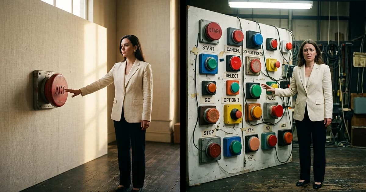
The 70% CTA kill rule: why one button beats many
The most repeated advice in conversion optimization in 2026 sounds reasonable: give visitors options. Two buttons, three calls to action, a "choose your path" hero. The thinking goes that more entry points capture more intent. The data says the opposite, and the gap is brutal.
Unbounce's 2026 Conversion Benchmark Report, built on 44 million conversions across thousands of landing pages, found that pages with a single primary call to action convert at 13.5% on average, while pages with five or more CTAs convert at 10.5%. That is a 29% lift from doing less. Stretch the comparison further to email and the gap turns surreal: campaigns with one CTA can drive 371% more clicks and up to 1,617% more sales than campaigns crammed with multiple offers, according to data compiled by WiserNotify in 2026.
If you have ever shipped a "version with options" against a "version with one button" and quietly watched the single-button page win, you already know. What you may not know is why agencies keep recommending the loser.
The kill rule, defined
The 70% CTA kill rule is shorthand for a pattern conversion teams keep hitting: every additional primary CTA on a focused landing page costs a meaningful slice of conversions, and stacked together those slices commonly add up to a 60-70% gap between the cleanest version and the busiest one. Unbounce's averaged 29% lift is the floor. In real audits across SaaS, lead gen, and e-commerce funnels, the spread between a single-purpose page and a "menu of paths" page often looks closer to two-thirds of total conversions left on the floor.
The mechanism is not new. It is Hick's Law (decision time grows with the number of choices) crossed with Barry Schwartz's paradox of choice (more options produce anxiety and inaction, not satisfaction). The Interaction Design Foundation summarizes the effect bluntly: when users face too many choices, they tend to choose nothing.
Why the popular advice sounds right
Adding CTAs feels safe. If one visitor wants a demo and another wants pricing, surely you should serve both? On a homepage or pricing page, yes. On a paid-traffic landing page tied to one ad, one promise, and one audience, no.
The trap is that "more options" feels like service while it is actually friction. Each new button forces a micro-decision: which one is for me, what happens if I pick wrong, is the other one better. Visitors do not weigh those questions consciously. They feel a small pulse of uncertainty and scroll, close, or leave. The button you added did not capture a second segment. It taxed the first one.
There is one honest exception. Unbounce's same dataset shows that long-form pages with complex offers (think enterprise software or high-ticket services) convert 23% better with multiple CTAs spaced down the page, because the decision genuinely requires scrolling and reassurance at different stages. That is repetition of the same CTA at different scroll depths, not competing CTAs side by side.
What the winning page actually looks like
Strip the page to one job. The hero states the outcome the visitor came for, not your category. The button says what happens next in the visitor's words ("Get my audit", "Start my free trial"), not "Submit" or "Learn more". First-person phrasing alone outperforms second-person by roughly 14% in Unbounce's data, and specific verbs beat generic ones by about 31%.
Everything else on the page either supports that one decision or gets cut. Secondary links, if they must exist, live far below the fold and visually demoted (text links, not buttons). The footer can hold the "see pricing" or "talk to sales" escape hatches. The fold cannot.
If you are running a focused offer and your hero currently has two equal buttons, you are almost certainly leaking conversions you will never recover with copy tweaks. The fix is subtraction, not optimization.
Why agencies hide this
Subtraction does not sell retainers. "We removed three buttons" is a worse pitch deck than "we redesigned the hero, rebuilt the funnel, and A/B tested 14 variants". The incentive points toward complexity. The data points toward focus.
Open the highest-traffic landing page you ship this quarter. Count the primary CTAs above the fold. If the number is greater than one, you have your next test, and the psychology of consumer choice is on your side, not your competitor's.
Related Reading:
Sources and References
- Unbounce 2026 Conversion Benchmark Report — Across 44 million conversions analyzed in 2026, landing pages with a single primary CTA converted at 13.5 percent on average versus 10.5 percent for pages with five or more CTAs, a 29 percent lift from removing options.
- WiserNotify Call to Action Statistics 2026 — Email campaigns with a single CTA can drive 371 percent more clicks and up to 1,617 percent more sales than campaigns with multiple competing CTAs.
- Interaction Design Foundation — Hicks Law shows that decision time grows with the number of choices presented; combined with the paradox of choice, the practical effect is that visitors faced with too many options often choose nothing at all.
Read about our editorial standards →